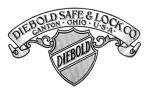
I thought I’d throw in some of the older Diebold logos. Sizes vary because of diverse sources for the images. You can click on them to see larger versions, as is usual for images.
The shield is from 1922 and taken from the US trademark office web site, so it’s a bit jagged. This was then fancified in an ad from 1923 -

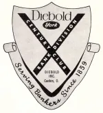
Another shield-like logo from 1959 was probably more of a one-off for a special purpose. Notice that it incorporates “York” which Diebold bought around 1946.
The more recent logo depended on a “swooshed” letter “D” which was trademarked in 1998.

Most of the other logos were simply the name “Diebold” or “DIEBOLD” in various fonts over the years, sometimes incorporating slogans like “Serving Business Since 1859”, “Bold New Approaches to Integrated Technology”, or “Innovation Delivered”.


